ICA SHOP + Café REBRANDING
The goal of this project was to reimagine the Institute of Contemporary Arts’ (ICA) Café + Shop brand identity in a way that better reflects the ICA’s creative, community-driven mission.
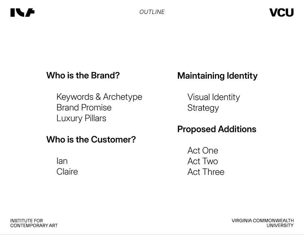
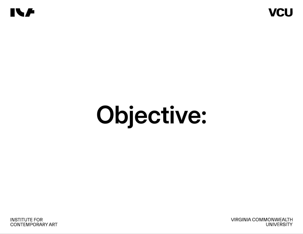
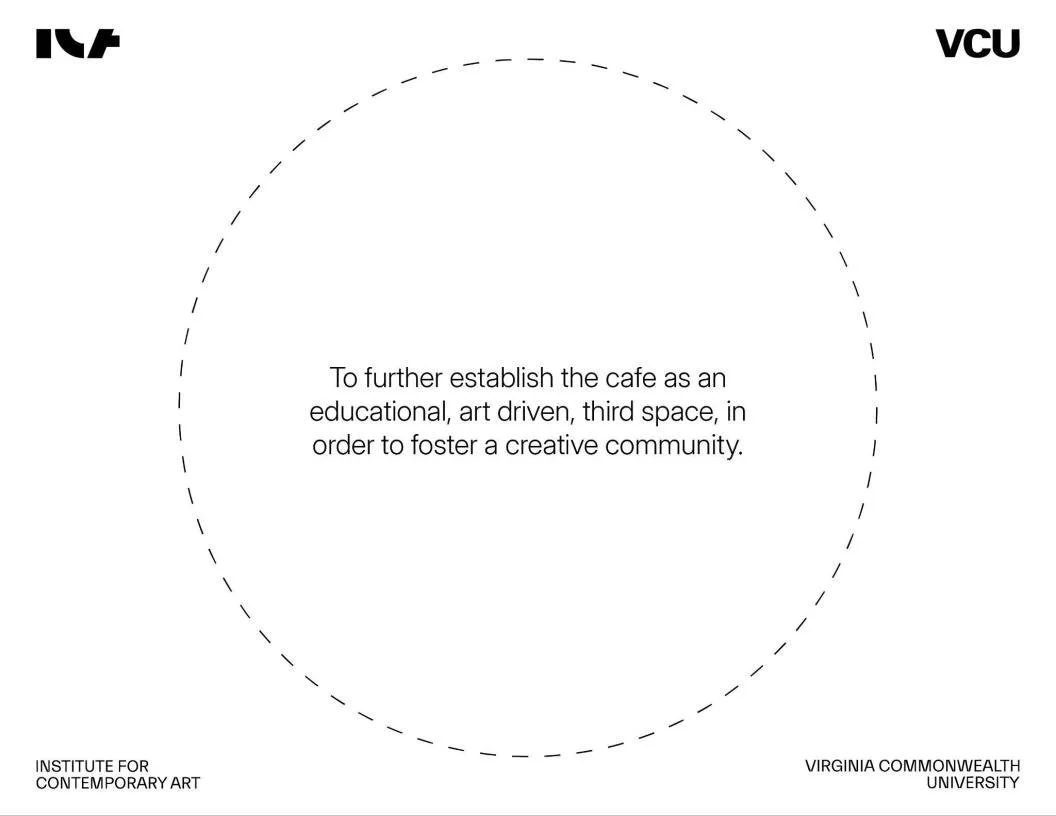
Our task was to audit the café’s existing brand, develop customer personas, refine its visual and verbal identity, and propose strategic additions that position the café as a welcoming “third space” for artists, students, and Richmond locals. This included establishing keywords, archetypes, luxury pillars, and a holistic identity system that reinforces the ICA’s role as a hub for creativity and connection.
my team
This was a collaborative group project completed with Sophie Routh, Rian Escueta, and Carter Hinds. We worked as a collective contributing our strengths in research, branding, design, and strategy. Our dynamic reflected the ICA’s own values: open communication, creativity, and thoughtful iteration.
I personally contributed much to product research and menu development. As well as writing and the refinement of visual identity and brand design. We were personally thanked by Mai Warshafsky (Head of Cafe and Retail Operations) for ensuring that the final product was not trying to change or fix the ICA into something new, but leaning into their image to reinforce who they already are.
We would have our team meetings in the ICA’s cafe in order to get a strong feel for the environment. We tried their food and coffee. I loved the cabbage toast and lychee soda. This is where the strength of our group work came from. My group members and I became close and looked forward to our next meetings at the ICA.
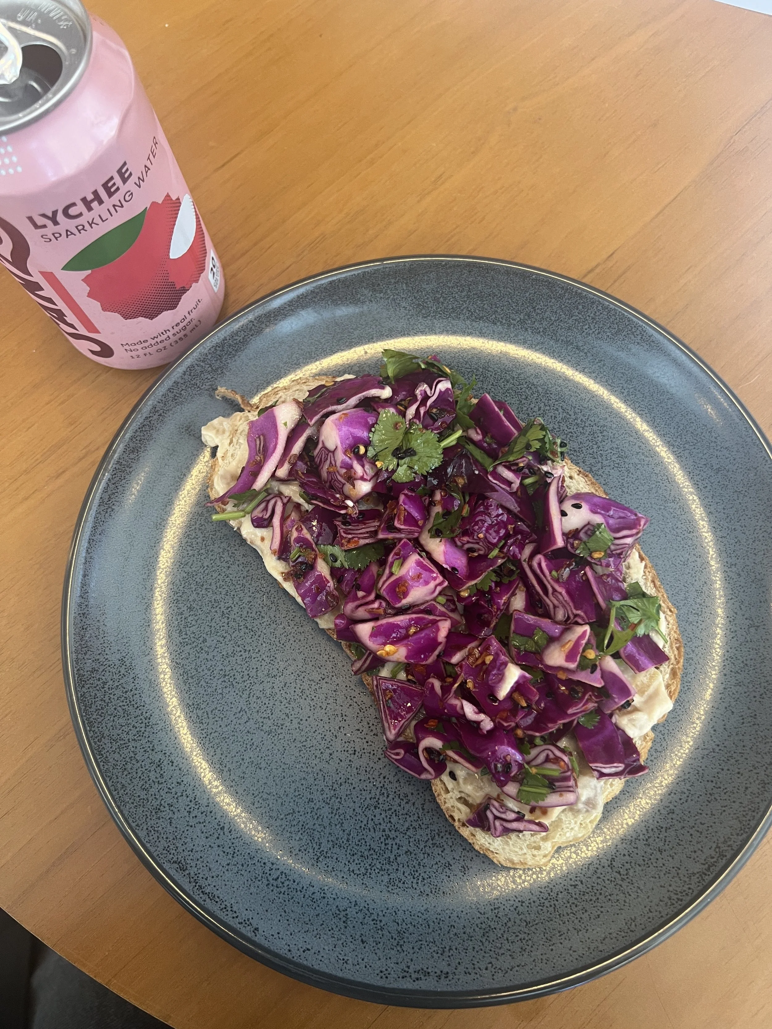
Crunchy Chili Cabbage Toast & Sanzo Lychee Sparkling Water from the ICA Cafe
Skills Demonstrated
-
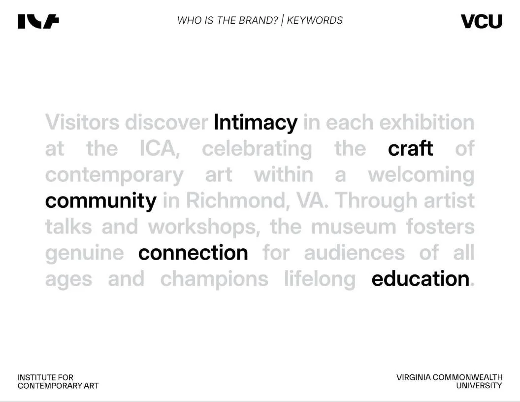
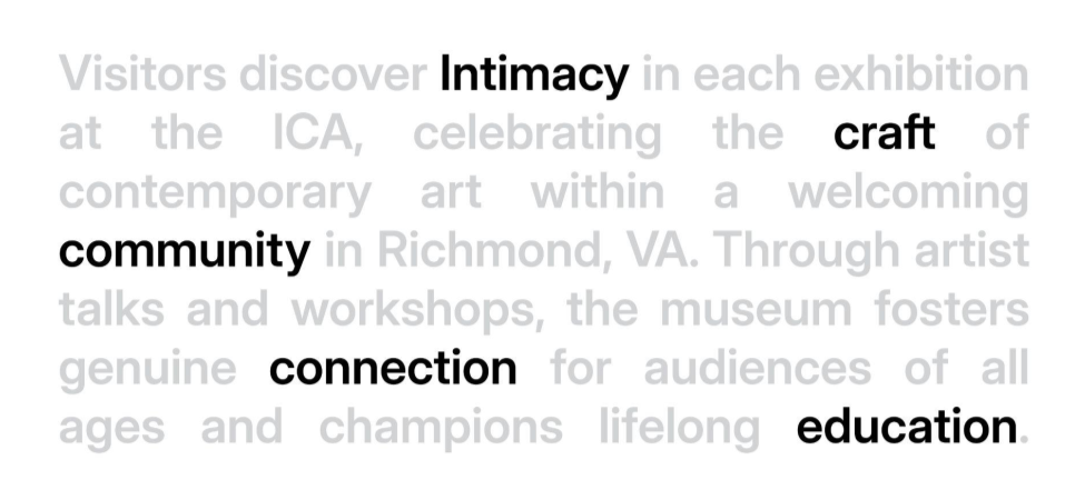
Developing keywords - Intimacy, connection, community, craft, and education.
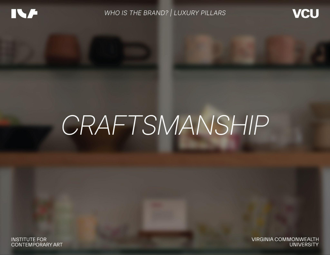
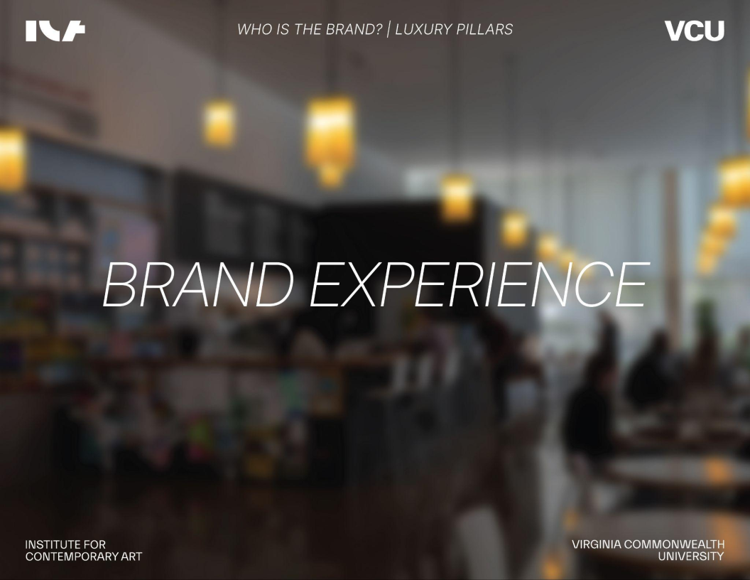
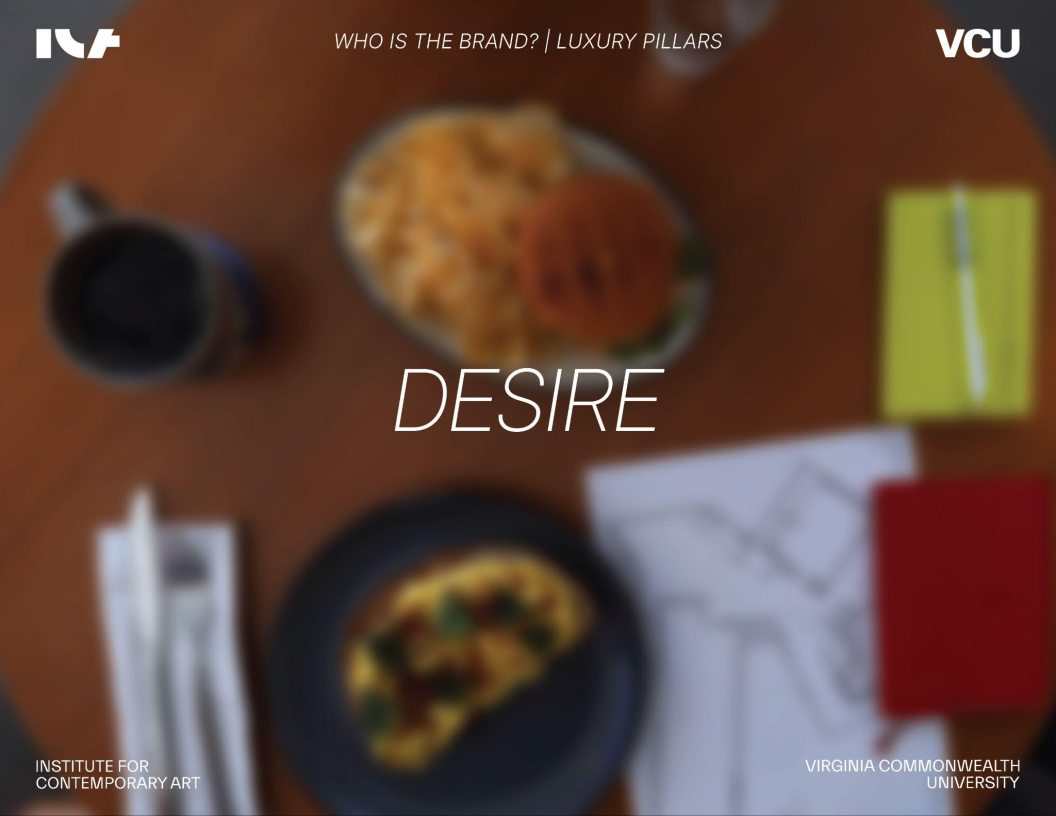
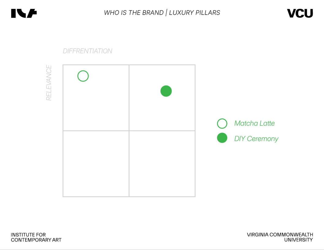
Luxury pillars - Craftsmanship, brand experience, and desire.
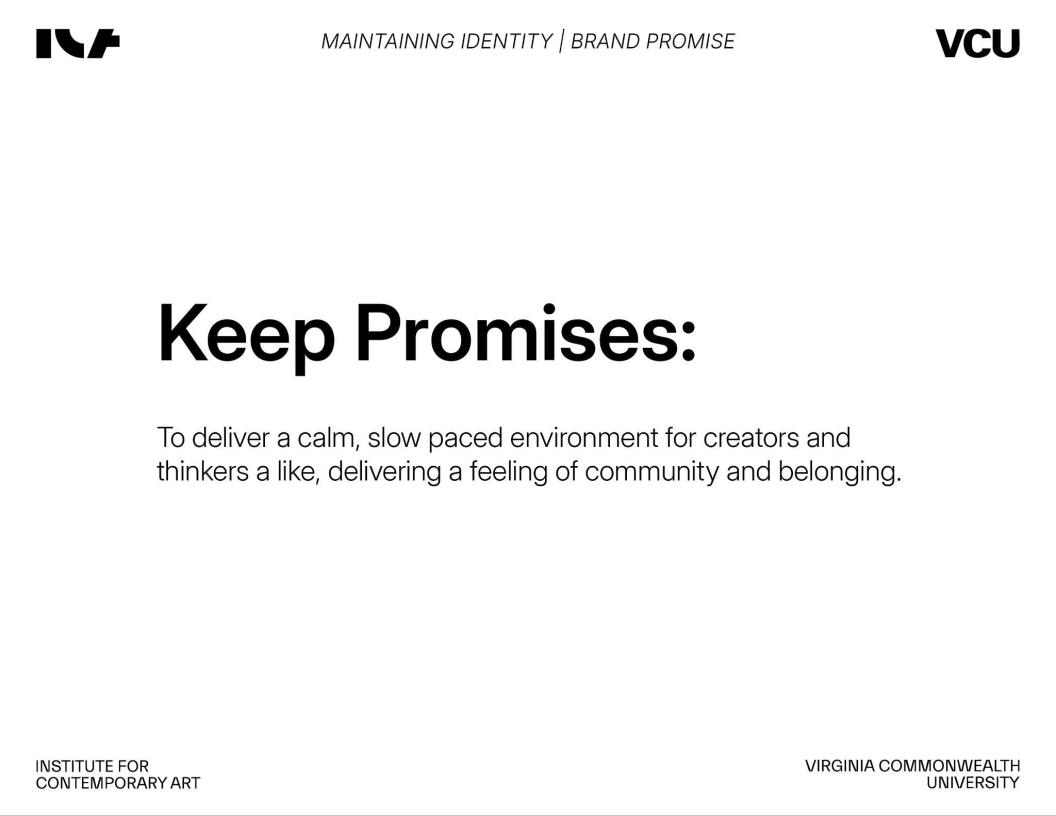
Cohesive brand promise - To deliver a calm, slow paced environment for creators and thinkers alike, delivering a feelings of community and belonging.
-
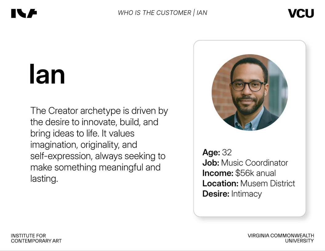
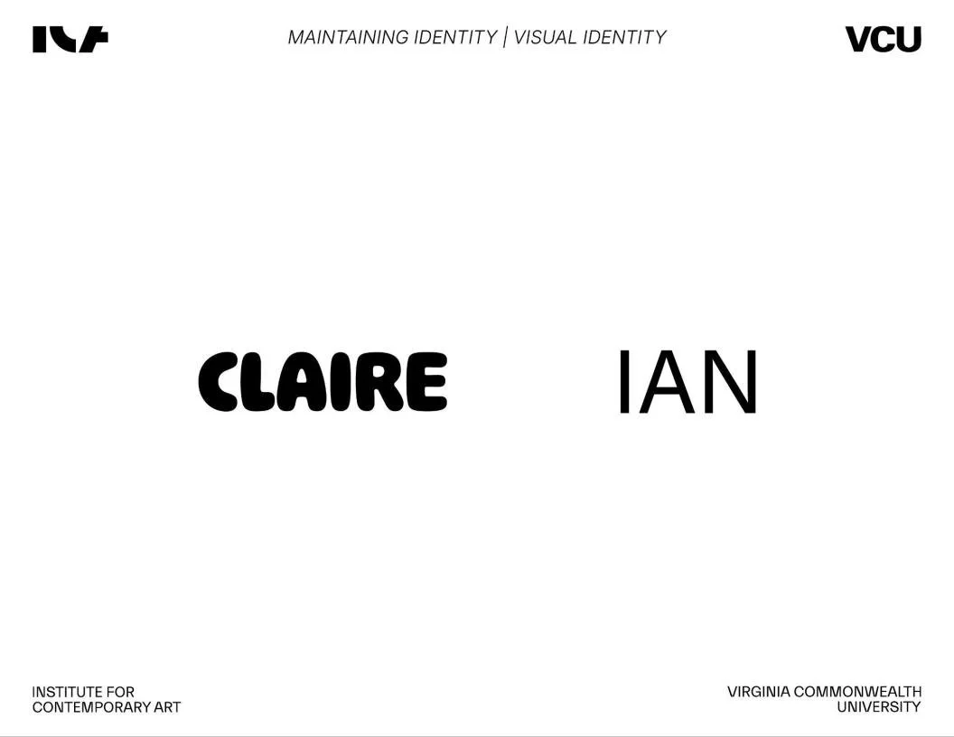
Ian - 32, music coordinator, $56k annual, located in the museum district, desires intimacy
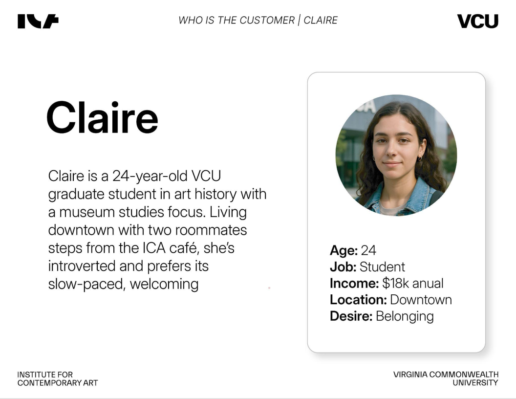
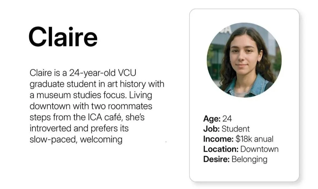
Claire - 24, student, $18k annual, located downtown, desires belonging
-
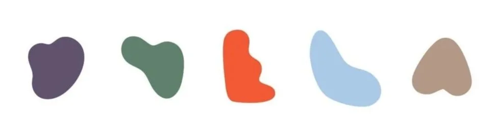
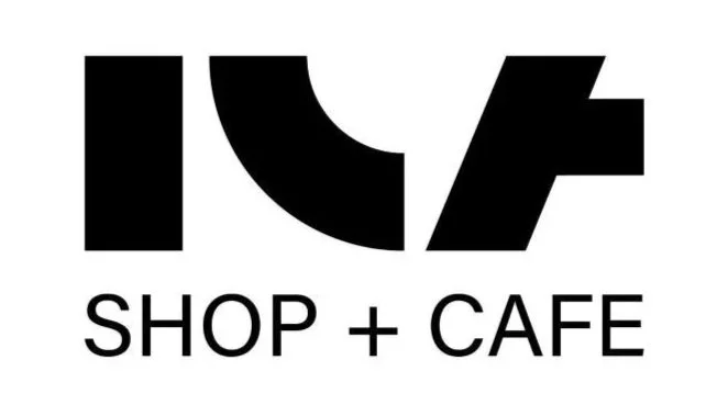
Explores shapes, typography, and logo applications for the cafe.
-
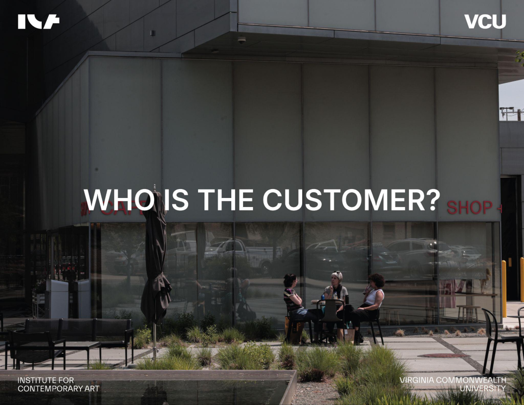
Understanding how the ICA functions as a third space for community and contemporary art.
-
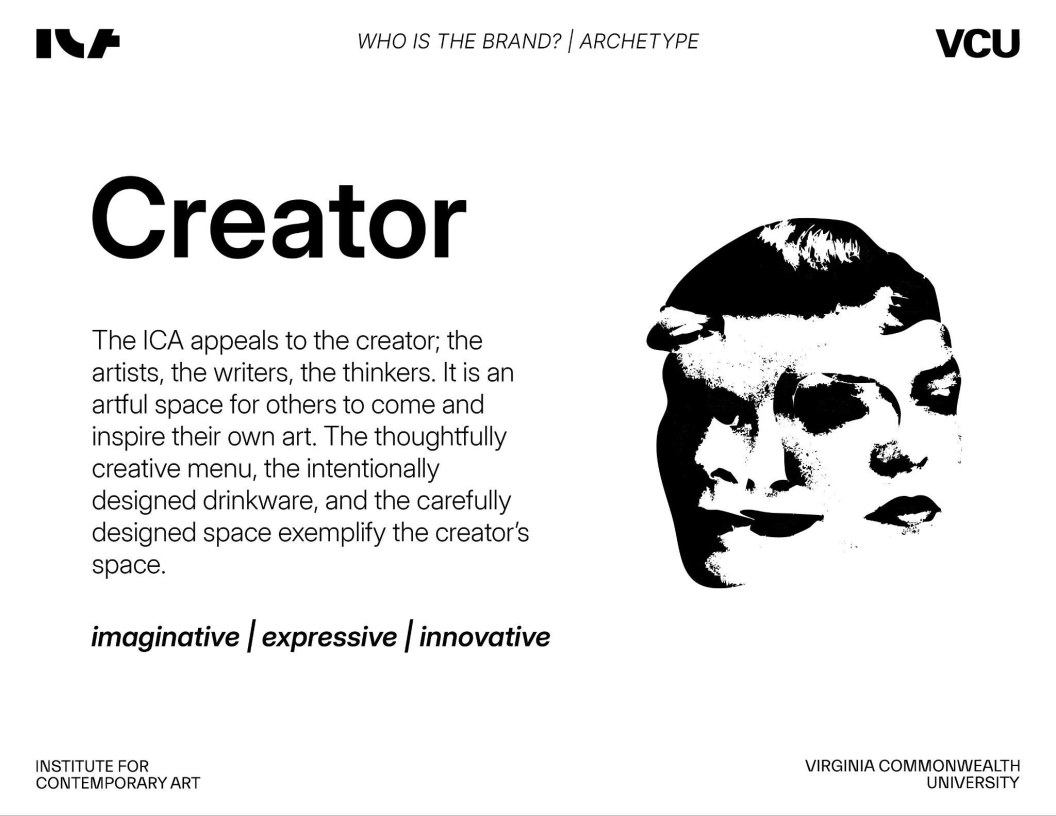
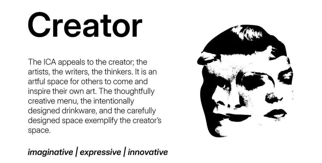
Aligning the cafe’s identity with the Creator archetype and its promise of intimacy, craftsmanship, and belonging.
-
Structuring the final deck and walking through brand insights clearly and visually.
Presentation in the ICA Theatre in front of Michael Lease (Director of Facilities and Experience Design) and Mai Warshafsky (Head of Cafe and Retail Operations)

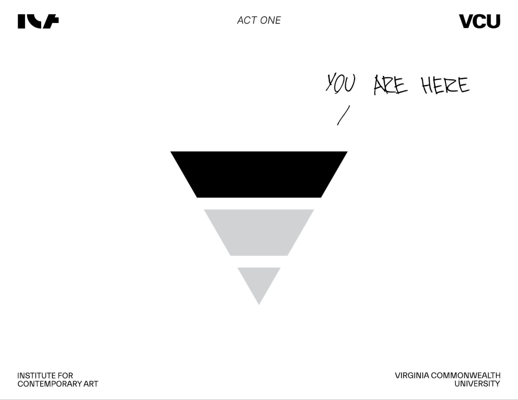
the process
We began by exploring the ICA’s essence by inserting ourselves in the environment. Therefore we could identify the core brand keywords which are intimacy, craft, community, connection, and education.
From there, we established the Creator archetype as the foundation for the café’s personality, emphasizing imagination, expression, and innovation.
To understand who we were designing for, we developed two personas:
Ian, a 32-year-old creator seeking intimacy and meaningful experiences
Claire, a 24-year-old grad student desiring belonging and comfort
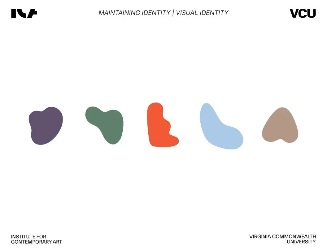
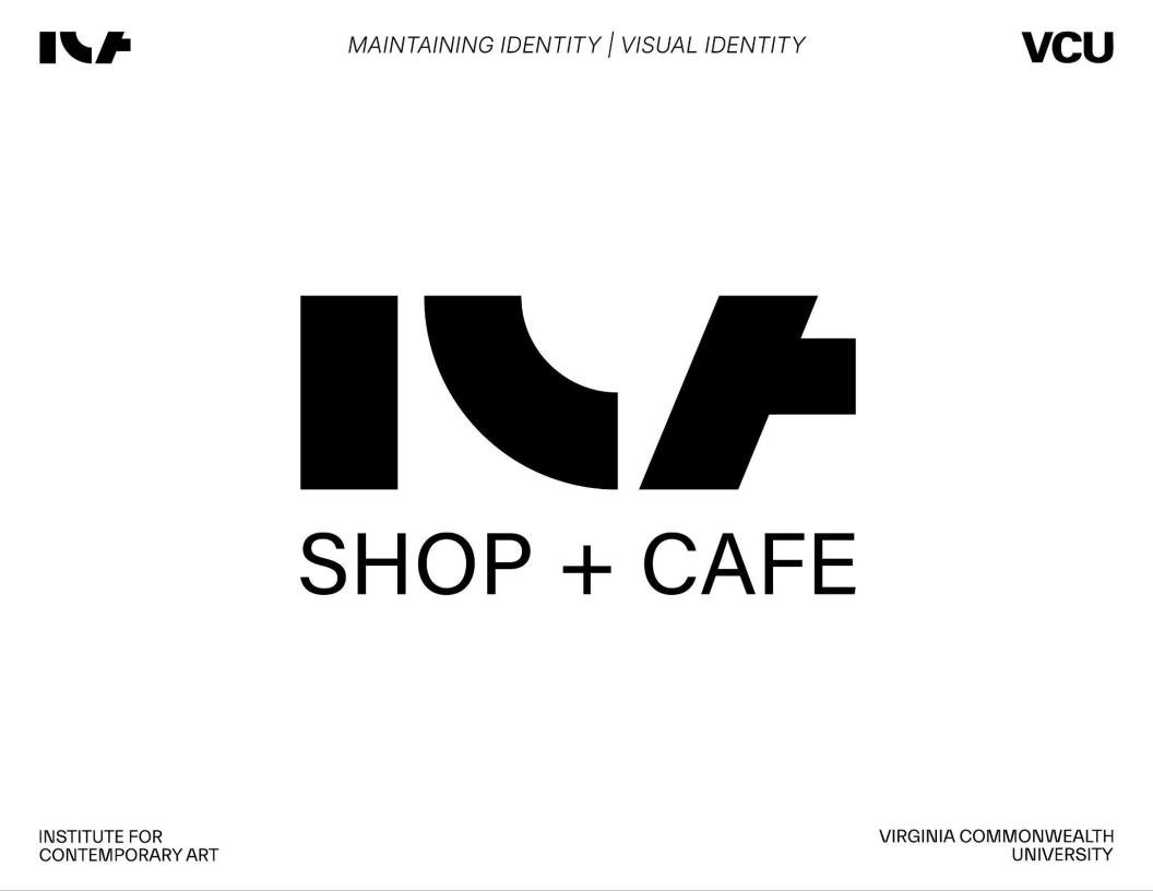
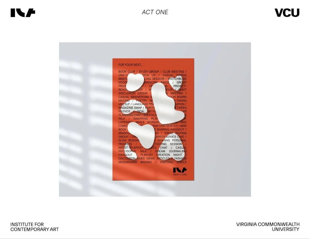
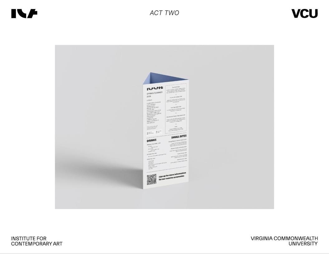
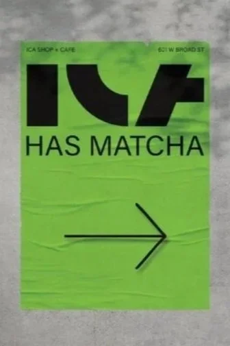
Next, we analyzed the ICA café’s physical and emotional identity. We decided to maintain the identity by keeping the set of abstract shapes and sticking with a refined SHOP + CAFE logo to maintain consistency.
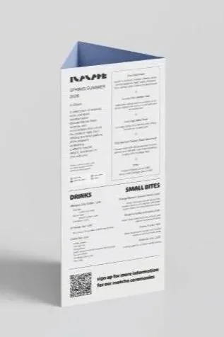
We also examined typography - Claire in font “Ohno Softie” and Ian in “Acumin Pro” which reflect each persona’s personality to ensure the identity feels adaptable yet unified.


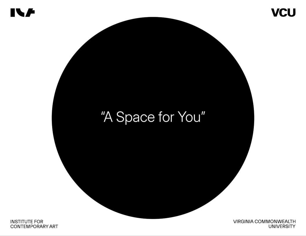
We aligned everything under the brand promise of delivering “a calm, slow-paced environment for creators and thinkers alike” and shaped our objective and positioning statement:

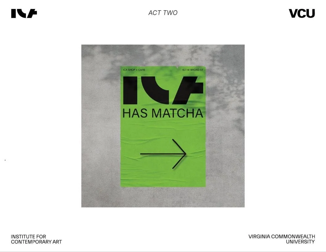
The group worked together to create visuals for our new ideas like adding matcha to the menu and opening up the ICA for VCU events.

Final thoughts
This project taught me how to translate a physical environment and institutional mission into a refined brand identity. I learned how to merge strategy with visual storytelling, balancing research, personas, and aesthetic choices to elevate the café into a meaningful cultural space.
Our final direction reinforced the ICA café as a comforting, intentional home for creators, strengthening its role as a community anchor and “third place.”
ICA Final Presentation Video
THE FULL PROJECT
View the full PDF below